
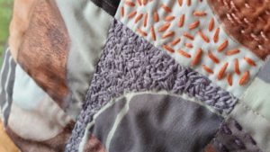
Studio time this morning: I picked two different fabrics I wanted to work with and started messing around with mini quilt size layouts using a square of rust dyed fabric as a base.
While I liked some things about them, I wasn’t very happy with the end results. Everything looked too purposeful. What I wanted was more accidental relationships that worked without being planned. I think what I needed was to feel, not see what was happening.
I tried a few different approaches, added a few more colors, stripped it down again to two, and then decided it was the size that was making it hard for me to work with. So I went small.
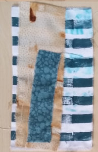
That worked so much better. It was much easier to find fabrics that needed to go together. I was also able to add a few more colors and prints.
I really like the torn edges and the uneven outline of the pieced elements.
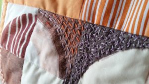
I basted the layers just a little, enough to hold them together while I stitch over them, and added a layer behind (initially as support, but I like what it adds to the pieces.)
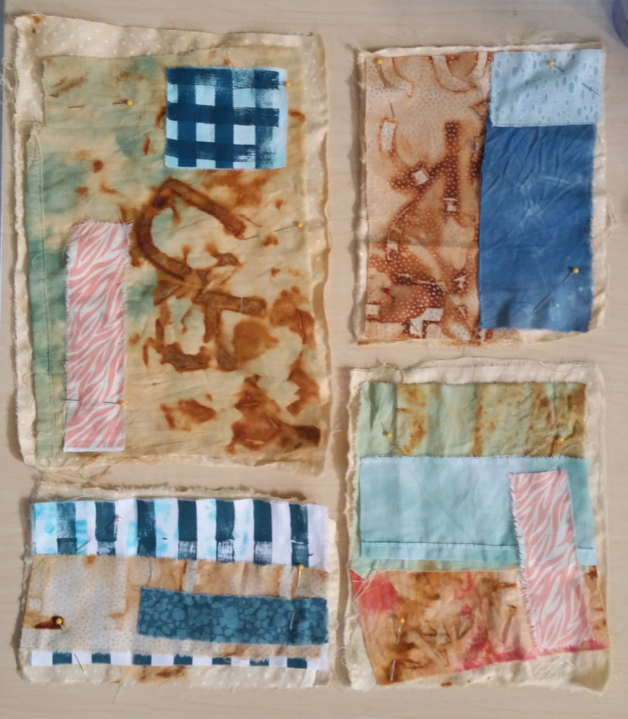
I’m still thinking about how to stitch on them and if they will go together like this (or another configuration) or be individual pieces in a series.
Looking forward to sitting with these some more to see where I go.
☆
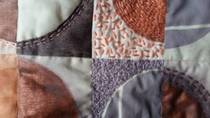
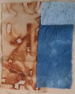
Using: hand dyed, rust dyed, commercial, and hand printed fabrics.
I feel like everything is a test right now, everything is a sketch. I don’t have a clear direction at all, which isn’t a bad thing necessarily, but I feel a little impatient to find a focus. Trying to remember to be patient and enjoy the process.
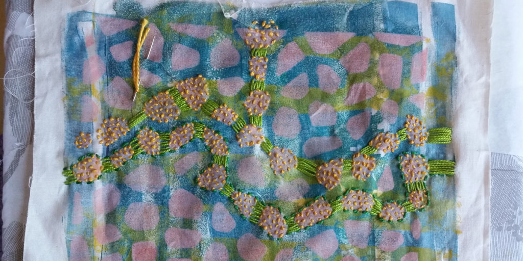
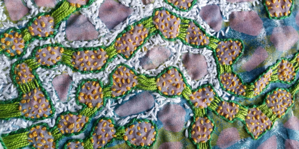
I’m spending a lot of time just stitching tiny stitches. It’s meditative and I love the textures that the tiny stitches create. Here, I tried something a little different and stitched over a gelatin print experiment.
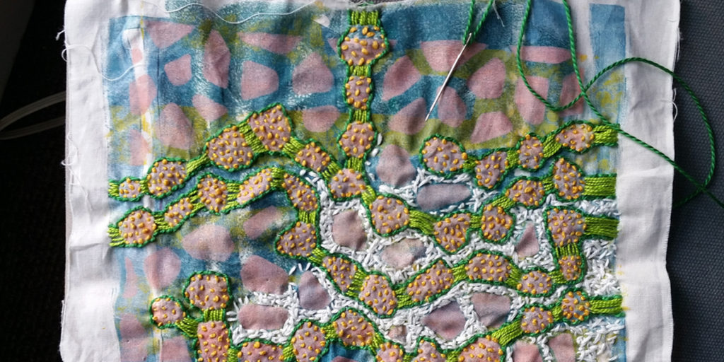
I was thinking of cells and connections and the spaces in between. I was also just enjoying the ways the colors influenced each other. And, of course, I love the texture.
If I continue, where will this go? Should I just keep stitching the way I have been? Should I add other fabrics? Should I paint parts of it? Use wax?
Getting past a work deadline means I have time to play. Yay!
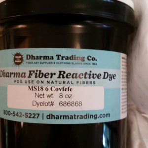
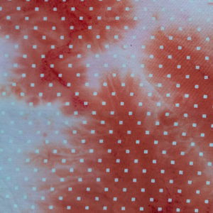
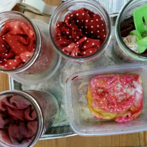
I bought some marked down dye from Dharma Trading Co (with the best color name ever) and ripped up a sheet a friend gave me. It’s a white on white pattern of tiny squares.
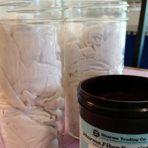
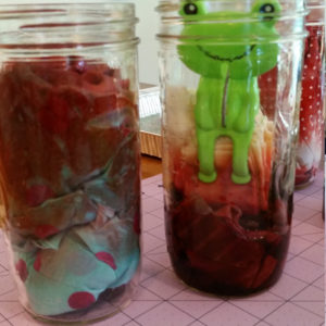
I think low water immersion dyeing is my favorite because it makes great textures, so I crammed my fabric into some mason jars hoping there’d be enough nooks and crannies to create interesting folds and shapes.
I mixed two batches of dye, one using about half the dye as the other. I was just eyeballing it, so I’m not sure how much it was exactly. I poured the liquid dye over the fabric from the top of the jar and let it soak in. One got pretty much saturated and the other ended up with some white undyed.
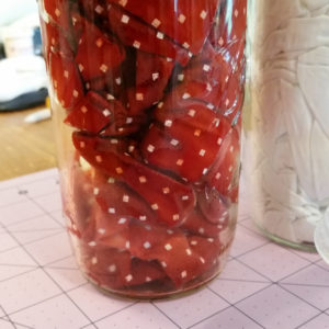
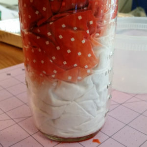
I let it sit about an hour before I rinsed it out. The pattern of the white squares was really obvious. I thought it would dye a little more than it did, but I still like the result.
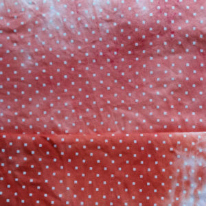
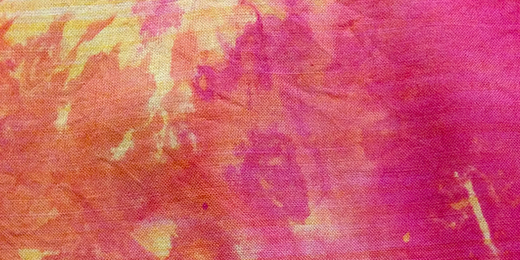
The photo on the right (above) is probably closer to the real color; it’s more pink than orange. It’s a very pretty color. Look at all that feathering. So nice.
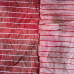
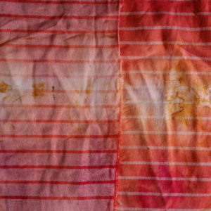
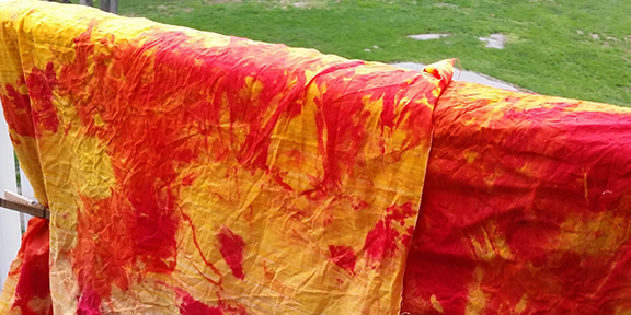
I had some other fabrics I wanted to try to overdye. One crappy Ikea curtain (that I used as a table cover for art shows for a while) that just looks terrible no matter what I do to it, and a couple of rust dyed fabrics that weren’t very remarkable. I crammed some of them into jars and one of the striped ones I folded and clamped, and only immersed the edge so the dye would wick upwards.
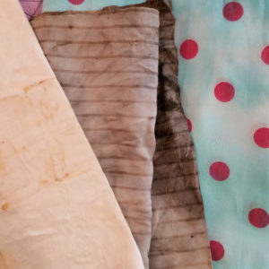
The crappy Ikea curtain was still wet, so I didn’t get a photo of it, but the striped fabrics turned out so beautiful. They’d been rust dyed with tea the first go around. The one that was immersed completely is now a deep red on one side and a beautiful pink on the other side (picture on the left, below). The one I folded (on right, below) came out with lovely gradations of red, orange, and yellow.
I love, love, love this process. I love the surprise textures the low water immersion creates. And while I don’t usually use anything but 100% cotton fabrics, the way the cotton sateen sheets dyed differently on each side was fun.
This was my second attempt at snow/ice dyeing. During my first attempt, I used snow (the last snow of the year (in April!)) and waaaay too much dye. The fabric dyed, but the results weren’t terribly interesting. At least, not any more interesting than if I’d tub dyed it. I was hoping for more novel textures I couldn’t get from just scrunching the fabric.
In this try, I used ice from a bag. I used commercially printed yellow fabric which I soaked in water and wrung out. I laid it out with random folds on top of a cooling rack (who could have predicted I would choose dyeing fabric over cooling cookies?) which I put over a dishpan.
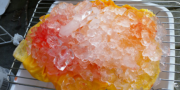
The first time I snow dyed, the fabric sat in the melted snow + dye mix, so I ended up with very few undyed areas. I thought elevating it over a pan might make the results more interesting.
I sprinkled the dye over the top of the ice. I was feeling impatient, so I put it in the sun to melt faster. I let it melt all the way down and then rinsed it out and laid it out over the banister to dry in the sun.
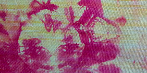
This picture (above) is way over saturated; it was bright, but not quite that bright.
These photos are after it was dry and ironed. There are some interesting textures, some color mixing, but I don’t think the dye I used was the best choice. There was no color separation, which was probably the dye.

Speckles are always interesting. And I like the mirror images that folds create, but I was hoping for more ice cube textures. I think I can just make out a few in the image below.
It’s a fun process, but I don’t think I’ve found anything exceptional about it. I feel like I could get these textures by tub dyeing. I think I need to experiment more.
Next time:
☆ use less dye
☆ don’t rush the melt
☆ combine with some kind of resist?
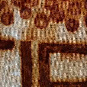
I have had plans for a while to make a quilt about my chronic anemia. Since it’s all about iron deficiency, it only makes sense to involve some iron in the making of the quilt itself. That means rust dyeing! Yay!
I had previously done some rust dyeing with washers and loved the way the dyed fabric looked. Sort of like red blood cells…or close enough to represent them, anyway.


I found some rusty metal letters online. I had no idea how many people sold rusty things online until I started looking for metal to rust myself for dyeing. I bought the whole alphabet plus some numbers and a few extra interesting shapes.


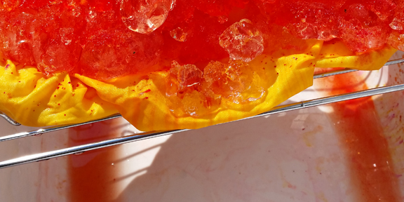
I soaked my fabric in vinegar, laid out the washers and the letters and then covered it with another layer of fabric. I made sure the top fabric made good contact with the metal. I love the subtle look of the metal showing through the wet fabric.


I also layered some printed fabrics (in a frisbee because I am a professional artist and use only the best, most professional equipment) with the letters and shapes I had left over.
It was a sunny day, so I put the tray and the frisbee in plastic bags and put them out on the porch in the sun. The iron was already oxidizing within a half hour. I left them for 5 hours and then opened them up to see how they looked.
So, how did they look? Dreamy!

Look at that delicious texture. And the printed silver still shows through the dye. I wasn’t very careful about the way I laid the fabric over the metal, so I ended up with some interesting folds and mirror images.
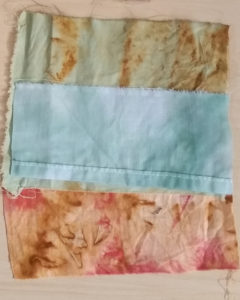
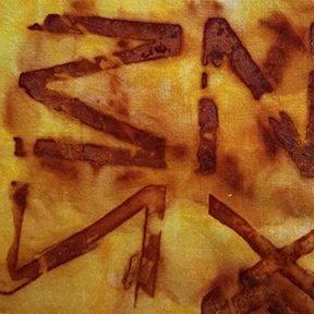
For the fabric I dyed specifically for the quilt, I put a piece of fabric under the metal and then on top, like a sandwich. The top piece of fabric got more air than the bottom, so the metal oxidized more (left image, below). It’s much darker, with less definition and texture. The fabric that was on the bottom (right image, below) has such great texture, but there were places where the metal didn’t affect the fabric at all, so some of the letters aren’t readable. I like both.

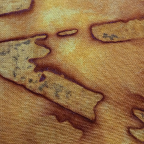
Below are the yellow printed fabrics I used. The left image was the top layer and the right was the layer on the bottom. So pretty!
I have one more piece of fabric to dye to finish the words I want to use in the quilt, and then I will figure out where I’m going with this whole thing. So much fun experimenting!
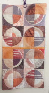
Circle study blocks
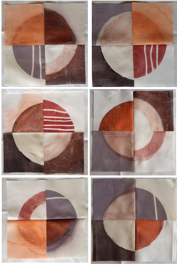
I wanted to do a bunch of circle blocks with the circles cut into quarters. That’s where I started. I cut some white and off-white fabric and used a circle stencil over a gelli plate to get the print.
I don’t know where this palette came from; it’s so far from what I normally use, but I don’t hate it.
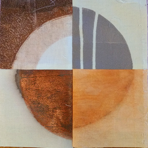
I wasn’t sure where I was going, but I knew I wanted a lot of variation in these prints.
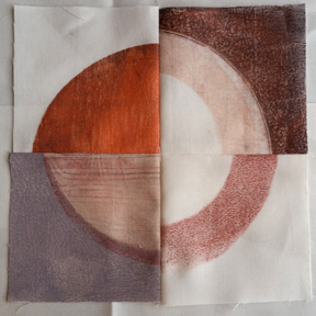
I did some positive prints and a few negative ones.
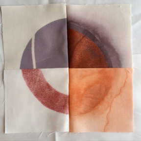
Some with string masks and sprayed some with water.
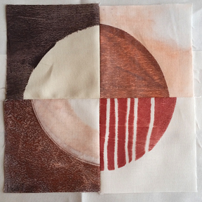
I like the ghost print in the bottom right of the block below. It was printed twice, once with the grey outside and then I overprinted the ghost print circle.

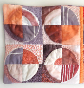
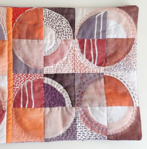
Even though the circles were all the same size, I didn’t cut the blocks all the same size, so there’s some places where the edges don’t meet up.

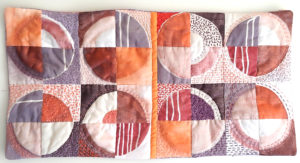
Another layout of the blocks.

I am going to do this again, a little smaller, with different colors. I also want to experiment with layout and not making all of them back into circles. I’d also like to try using a block print to apply the paint instead of the gelli print to see which I like better.
I headed into this with the vaguest of plans. My favorite way to start any project. I bought some craft foam shapes and cut them up. I thought what I wanted was to create some fabric to add to a WIP, so I used the same ink/colors I’d used in that project, but I ended up going in a totally different direction.
Simple, simple, simple process: block printing on fabric using shaped foam blocks.
I’ve bought so much of this white and silver fabric. It dyes beautifully, with the silver dots still showing through. I was happy to see the metallic ink is still visible after printing on it.
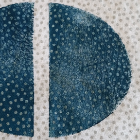
I added some water to see if I could make the shapes more interesting. I envisioned quilting/stitching around the original shape if I ended up using the print in anything.
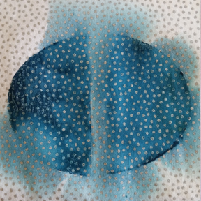
Layered print/color.

With string resist (scrounged from the sewing trash). Now I don’t feel so bad about all that sewing thread I end up throwing out; at least some of it gets another life.
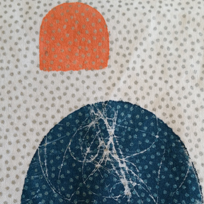
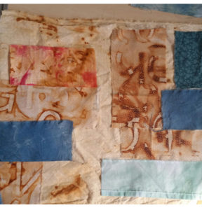
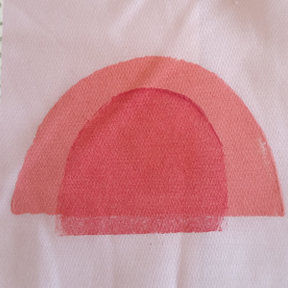
First attempt at a pieced composition.
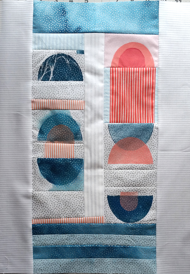
I think it’s a start. I can see a few things I’d change if I started over. I’m going to try out some different quilting styles to see what I like on top of these kinds of prints. And because sometimes you just have to see a project through to prove you can.
![]()
< 初めまして!
よろしくお願いします >